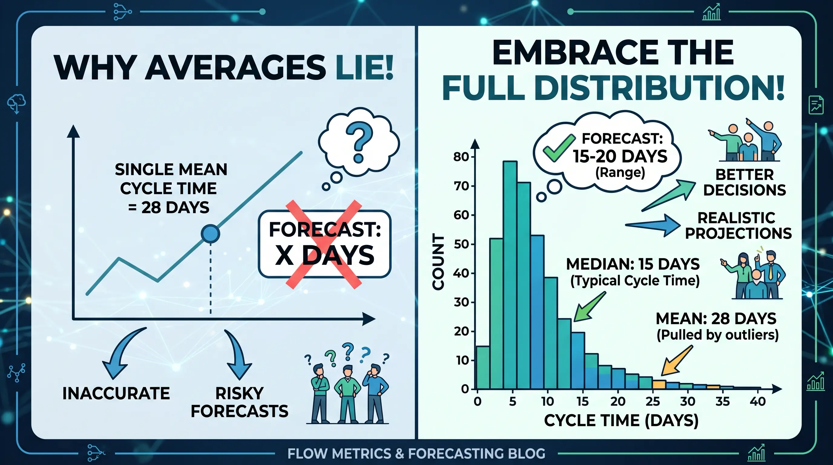
A Monte Carlo forecast confuses clients for a specific, fixable reason, and it isn't the math. It's that every estimate they've ever been handed before this one was a single number — a date, boiled down from a project plan and delivered with more confidence than it deserved. The first time someone puts a curve in front of them instead of a number, the instinct isn't "this is more honest." It's "this looks complicated." Losing the room in that meeting is almost never about statistics literacy. It's about what you lead with, what you skip, and what you let the chart do versus what you say out loud.
Open with the date, not the shape
Don't open the meeting with a histogram on screen. Open with a sentence: "We're confidently targeting March 14th." That's the Commercial number — the P85 date this blog treats as the sane default — and it's the thing the client actually came for. The curve is the evidence behind that sentence, not a replacement for it. If the first thing a non-technical stakeholder sees is a wide, unlabeled distribution, they'll spend the meeting trying to parse a picture instead of hearing the number, and every question after that comes from confusion instead of genuine interest.
The thing you're actually fighting is an old average, not a lack of stats knowledge
Most of the pushback in these meetings isn't really about probability — it's residual trust in a single average number from somewhere else: a past vendor's estimate, an internal project plan, a "roughly four weeks" someone said in an earlier call. That's exactly the failure mode in the image above. A single mean gets dragged upward by a handful of slow outliers, so it reads as pessimistic and vague at the same time, and it's the reason a client has learned to distrust estimates in the first place. You don't need the words "mean" or "median" to fix that. You need one sentence: "One unusually slow ticket doesn't move this date — we planned around what's typical for this kind of work, not around the rare bad week." That single line usually does more to build trust than the chart itself.
Explain the method in one sentence, and only if someone asks
If a client asks how the date was produced, there's a version of the answer that needs no jargon at all: "We looked at how this exact kind of work has actually gone over the last several weeks on this team, and ran that pattern forward thousands of times to see how often we'd land by any given date." That's the whole model — the full explanation of what a probability distribution is and why a delivery date needs one lives elsewhere on this blog for anyone who wants the longer version themselves, but it doesn't belong in the room. Don't say "Monte Carlo simulation," "iterations," or "confidence interval" first. If the client uses that vocabulary before you do, match it. Until then, stay in plain English.
If the curve goes on screen, give it exactly three callouts
Sometimes it's worth showing — a client who wants to see the rigor behind the number, or one sophisticated enough to ask for it directly. When it goes up, treat it as a single exhibit, not a walkthrough. Point at three things and stop: where the bulk of the outcomes cluster, which is roughly what "typical" looks like for this work; the committed date, marked clearly on the curve, so the client can see exactly where the promise sits relative to the pack; and the long tail trailing off to the right, described as "the rare slow stretch, not the expected outcome" so it reads as honesty about risk instead of a hedge. Nothing else on that chart needs narrating. Walking the cursor bar by bar is how a confident five-minute exhibit turns into an accidental statistics lecture.
Send the picture, not the live spreadsheet
Screen-sharing a live forecasting tool invites exactly the wrong kind of question — a client starts asking about individual rows, ticket names, or why one bar looks different from the one next to it, and the meeting drifts into internal detail that was never theirs to see in the first place. A clean, static export of the same three dates and the same curve is the better artifact, and it's the same principle behind what actually belongs on a client-facing portal: show the number and the shape that supports it, not the working data behind it. Send that image in the follow-up email. It's the thing they'll actually reread before the next check-in, long after the meeting itself is forgotten.
None of this is about hiding the math or dumbing it down. The distribution is more honest than a single date ever was, and that honesty is worth defending. The job in the room is translation: lead with the number, defuse the old-average instinct in one sentence, keep the method to one sentence more, and let the picture do exactly three things before you move on to what actually matters — what happens next.