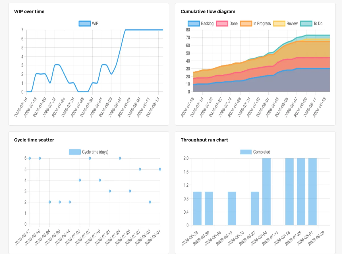
The flow metrics page has four charts on it, and it's easy to treat all four as roughly the same kind of thing — background data, nice to glance at, not the main event. That undersells two of them badly. The cycle time scatter and the throughput run chart aren't just describing your team's forecast. They are your team's forecast, in raw form, before a Monte Carlo simulation turns them into P50/P85/P95 dates. The other two — WIP over time and the cumulative flow diagram — are less about the forecast directly and more about catching a problem before it shows up as a missed one. Here's what each chart is actually telling you.
WIP over time
WIP means work in progress: tickets that are actively being worked on right now, not sitting in the backlog and not yet done. This chart plots that count across time — how many tickets were "in flight" at once, week over week.
It matters because of a simple relationship that holds regardless of team size or process: cycle time equals WIP divided by throughput. Take on more concurrent work without finishing more of it, and the tickets already in flight take longer to get through — not because anyone got slower, but because there's more competing for the same attention. A WIP count that climbs and stays high, without throughput climbing to match, is usually the earliest visible sign of a bottleneck, and it shows up here well before it shows up as a missed date.
Cumulative flow diagram
The cumulative flow diagram (CFD) stacks every column on the board — Backlog, To Do, In Progress, Review, Done — as bands in a single area chart, each one showing how many tickets have accumulated in that stage over time.
Two things are worth watching in a CFD. First, band thickness: a band that stays a roughly consistent width is a stage moving tickets through at a steady rate; a band that visibly widens over time is a stage where tickets are piling up faster than they're leaving — a bottleneck, made visible before anyone has to say the word "stuck" out loud. Second, the overall shape: bands that rise together, roughly parallel, describe a board where work is flowing smoothly from stage to stage. Bands that diverge — one climbing steeply while others stay flat — describe a board where work is getting stuck somewhere specific.
Cycle time scatter
This is the one that's easy to skim past and shouldn't be. Every dot on this chart is one completed ticket: its position on the x-axis is when it was finished, and its position on the y-axis is how many days it actually took, start to done — deliberately not the same clock as lead time, which would also count how long the ticket sat waiting in the backlog first. See cycle time vs. lead time if that distinction isn't already second nature.
That scatter of dots is not a summary of your team's cycle time — it is your team's cycle time, in full, with nothing smoothed over. A tight cluster near the bottom means most tickets move fast and predictably. Dots scattered higher up are the tickets that took much longer than typical — the ones that quietly blew past their expected size once someone actually started them. This is also, directly, one of the two datasets PtahCast's Monte Carlo simulation resamples from when it builds a forecast. There's no separate, hidden model behind the forecast page — it's built from exactly the distribution of dots shown here.
Throughput run chart
The throughput run chart counts something different: not how long any individual ticket took, but how many tickets got finished in each period — typically week by week. Each bar is one week's total.
Some weeks will be higher, some lower, and that's expected rather than a problem to solve — holidays, a run of small tickets, one large ticket eating a whole week, they all show up as natural noise in this chart. What matters for forecasting isn't any single bar, it's the full spread of them: the range of "how many tickets does this team actually finish in a typical week" that the chart represents. Alongside the cycle time scatter, this is the second dataset the Monte Carlo simulation draws from directly — it's the throughput half of the forecast, sitting in plain view.
Where this ends up
The cycle time scatter and the throughput run chart aren't supporting evidence for the forecast page — they're its ingredients. Every one of the 10,000 simulated trials behind a PtahCast forecast is built by resampling from exactly these two charts: how long tickets have actually taken, and how many actually get finished per week. If you want a sense of why a forecast looks the way it does, or why it moved after a bad sprint, these two charts are where to look first. WIP over time and the cumulative flow diagram won't change the forecast directly, but they're usually the earliest warning that the underlying numbers are about to.
For more on how those two charts turn into an actual delivery date, see Why Monte Carlo Forecasting Beats a Single Delivery Date.