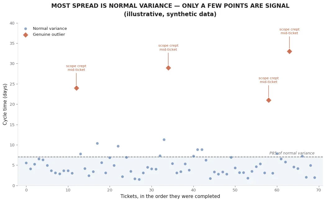
The flow metrics post covered all four charts on the board at a survey level — WIP over time, a cumulative flow diagram, a cycle time scatter, a throughput run chart. Of the four, the cycle time scatter is the one with the most nuance still on the table. It's also the one people misread most often, usually in the same direction: seeing a scattered cloud of dots and concluding the data is messy, when most of what's on the chart is exactly what healthy variance is supposed to look like.
Most of the spread is supposed to be there
Work isn't uniform. A cycle time scatter with points ranging from two days to nine days, with no obvious pattern, isn't a chart with a data quality problem — it's a chart showing that different tickets, even similar ones, take different amounts of time for ordinary reasons: one had a quick review, another sat over a weekend, a third needed a second pass. That spread is the raw material a Monte Carlo forecast is built to work with. It's not noise to be cleaned up before forecasting; it's the actual signal about how this team's work behaves.
The instinct to tidy up a noisy-looking scatter before trusting it is understandable, and it's usually the wrong instinct. Deleting the messy-looking points removes exactly the information a probabilistic model needs to produce a realistic range instead of a falsely narrow one.
What an actual outlier looks like
A genuine outlier is a different thing from ordinary spread, and it's rarer than it looks on a first glance at a busy chart. The clearest tell is a point that sits well outside the rest of the distribution and has an identifiable, one-off cause behind it — scope that expanded significantly after the ticket was already in progress, a dependency that turned out to require work nobody had scoped, a ticket that was effectively paused and resumed weeks later for reasons unrelated to normal queueing. In the chart above, four points are marked this way: each one is far outside the P85 line of the surrounding normal variance, and each one has a specific, nameable reason it doesn't represent typical throughput.
Compare that to a point that's merely on the high side of normal — a ticket that took nine days when most take four or five. That's not an outlier. That's the tail of a real distribution, and a Monte Carlo forecast is specifically designed to account for tails like that showing up again.
Why deleting outliers before forecasting is usually a mistake
It's tempting to treat outlier removal as basic data hygiene — the same instinct that says to clean bad rows out of a spreadsheet before running an analysis. Cycle time data doesn't quite work that way. Removing every high point on the chart doesn't produce a cleaner picture of how the team works; it produces an artificially optimistic one, because it deletes the exact evidence that ticket-level surprises happen at a certain rate. If four tickets out of seventy genuinely went sideways for identifiable reasons, that's not an anomaly to erase — it's a real rate of occurrence a forecast should be aware of, because the next seventy tickets will very likely include a similar number of surprises of their own.
The right move for a true, identifiable outlier isn't deletion — it's a note. Flag it, understand why it happened, and decide deliberately whether it represents a risk that's now been addressed (a dependency that's since been resolved) or one that's still live (a class of ticket that reliably runs into the same kind of surprise). Either way, that's a judgment call worth making explicitly, not a cleanup step to run reflexively before every forecast.
The practical read
When looking at a cycle time scatter, the useful question isn't "does this look messy." It's "does the spread look like ordinary variance around a stable center, or does it look like more than one process is mixed into the same chart." A wide but stable-looking cloud, even a genuinely noisy one, is exactly what a Monte Carlo forecast is designed to resample from faithfully. A chart with a handful of dots sitting far outside everything else, each traceable to a specific cause, is worth a second look — not because the model can't handle them, but because understanding why they happened is worth more than average-day insight into where the process might be leaking time.